We have been planning the postcards, I have been designing the postcards on Adobe Illustrator and creating the look for them. I have designed a front and a back, and I have thought about what should go on the postcards and where it should go.
We have now changed the design of the postcards, they are now A5 front and back. On the front we have Penwith college the course name and a picture of the building that the specific course is located in.
This was the first initial design for the front of the postcards, its simple and is set for the seperate subjects.
We then decided that we should place a picture on it somewhere.
We found the college logo and edited it in Adobe Illustrator, we designed it for an A5 sheet of paper. We then stuck with the green colour scheme and put the name of the course at the bottom.
This is a design that we got from the first initial design, but we have placed a picture of the Zennor building in the background and changed the opacity of it so that we could see the writing.
The picture of the Zennor building is relevant as it tells you that the Creative and Media diploma is located in the Zennor building.
We may have to change the width of the writing, so that it becomes more clearer on top of the picture.
This is the first design for the back, the layout is again simple, but shows the information needed.
But still we decided that it'd be best to add pictures.
The student comments looked a bit out of place, we had to seperate the two with lines.
The information is set in bullet point format, to make it more appealing to younger readers, as they wouldn't want to read a whole paragraph.
We have placed the Penwith website address on the back so that people who are interested in the course can go there to find more information.
Now that we have designed and printed a postacard that we are happy with, we now have to create postcards for the other subjects. We have to change the writing to be relative to the subject and change the pictures.
Wednesday, 23 March 2011
Monday, 21 March 2011
Shot lists.
-Shot list for our dance webisode.
-Shot list for our drama webisode.
-Shot list for our art webisode.
-Shot list for our health and social webisode.
We had a look around Porthcurno today and wrote down the rooms that we are going to film, then we started to think about how we would film them and in what order. We are planning to film on Monday during one of our lessons we will be filming the rest of Zennor and hopefully Porthcurno. Then we shall get the rest of the filming done and then we will start to edit. We have edited the start of the Zennor film, we have to show this to Martin on Monday so he can see how were progressing and so he can give feedback and tell us anything that is wrong or right. This also helps towards client feedback.
- Shot 1- Title- Dance department = 3-4 seconds.
- Shot 2- Dance routine of group = 7 seconds. (Long shot).
- Shot 3-
- Shot 4- Interview = 10 seconds. (Medium shot).
- Shot 5- Dance routine of group = 7 seconds. (Long shot).
- Shot 6- Another Interview = 8 seconds. (Medium shot).
- Shot 7- Reversing out of the dance hall = 5 seconds. (Long shot).
-Shot list for our drama webisode.
- Shot 1- Title- Drama department = 3-4 seconds.
- Shot 2- Acting = 7 seconds. (Long shot).
- Shot 3- Interview = 10 seconds. (Medium shot).
- Shot 4-
- Shot 5- Rehearsing a script = 7 seconds. (Close up).
- Shot 6- Interview = 8 seconds. (Medium shot).
- Shot 7- Reversing out of the drama hall = 5 seconds. (Long shot).
-Shot list for our art webisode.
- Shot 1- Title- Art department = 3-4 seconds.
- Shot 2- Artwork = 7 seconds. (Long shot).
- Shot 3- Interview = 10 seconds. (Medium shot).
- Shot 4- More artwork = 4 seconds. (Close up).
- Shot 5- Making = 7 seconds. (Long shot).
- Shot 6- Interview = 8 seconds. (Medium shot).
- Shot 7- Reversing out of the art room = 5 seconds. (Long shot).
-Shot list for our health and social webisode.
- Shot 1- Title- Health and social = 3-4 seconds.
- Shot 2- Teaching = 7 seconds. (Long shot).
- Shot 3- Interview = 10 seconds. (Medium shot).
- Shot 4- Visual = 3-4 seconds. (Long shot).
- Shot 5- Interview = 8 seconds. (Medium shot).
- Shot 6- Students work = 7 seconds. (Medium, close up shots).
- Shot 7- Reversing out of the room = 5 seconds. (Long shot).
- Shot 1- Title- The Zennor building at Penwith college.
- Shot 2- Library- starting by the lift. (Long shot).
- Shot 3- Leave library and turn down the corridor.
- Shot 4- Walk down the corridor.
- Shot 5- Mac suite walk into (Fade out).
- Shot 6- (Fade in) Beauty room, backing out.
- Shot 7- Walk down the corridor.
- Shot 8- Walk into hair salon (fade out).
- Shot 9- (fade in) Recording studio.
- Shot 10- Mixing desk in the recording studio. (Close up).
- Shot 11- Walk down the corridor.
- Shot 12- Enter drama hall and walk through.
- Shot 13- Walk out and enter catering.
- Shot 14- Catering kitchen. (Close up).
- Shot 15- Walk around into the lecture theatre.
- Shot 16- Showing people watching a film.
We had a look around Porthcurno today and wrote down the rooms that we are going to film, then we started to think about how we would film them and in what order. We are planning to film on Monday during one of our lessons we will be filming the rest of Zennor and hopefully Porthcurno. Then we shall get the rest of the filming done and then we will start to edit. We have edited the start of the Zennor film, we have to show this to Martin on Monday so he can see how were progressing and so he can give feedback and tell us anything that is wrong or right. This also helps towards client feedback.
Powerpoint for Martin Tucker.
-Target Audience.
-As a result of these we have come up with these ideas: Webisodes.
- The main audience is for 16-28 year olds.
- Our ideas need to be short and catchy to appeal to the target audience.
- People in secondary schools to adults who want to study again.
- People from last year did postcards so we need to make them more eye catching and innovative so it shows we are creating and developing our own ideas that would suit the target audience.
- Are important as it gives the target audience a more realistic opinion of the college compared to the lecturers and head of the college.
- Also they are people who are the same age and will be able to relate easier.
-As a result of these we have come up with these ideas: Webisodes.
- Last week we went around the college and shot some of our footage.
- The target audience has been brought up around the internet and websites such as 'YouTube'. They spend more time on the internet than other generations before have, this is why we have chosen the webisodes idea.
- The storyboards have been planned to make filming the webisodes easier to film. Also this way we can have enough footage for the 45 seconds.
- We have adapted the postcard idea so that its a foldout information booklet, it will have 8 sides for more information.
- They are only going to be made up of A4 card so that they can fit into pockets and be easier to carry around.
- We feel that this appeals to the target audience more than a massive booklet would.
Thursday, 10 March 2011
This week - planning.
We have started to plan our webisodes this week, we are planning on getting the storyboards done and film porthcurno and Zennor on Monday. Then next week, we will plan when we are going to film the lessons. We will be asking the lecturers in that week, then hoping to film the week after. We have planned out which rooms in Zennor we should film. They are Z308, Z310, Z301, Z212, Z207, Refectory, Reception, Z006, Lecture Theater, Dance and Drama, Catering and Z025. This is going from the top floor down to the ground floor.
We are now thinking about how we will film and how long each shot should be. We have mind mapped what will go into each shot and what we should include in each 45 second film. We have drawn up some rough shot lists and have planned out each shot, how long it should take, what will be in the shot, plus looking for the important things to film and the best effective. We are going to film the Zennor building tomorrow, so that we have something to show Martin Tucker when we see him next week, this builds up the relationship with the client and also gives them an insight as to how the product will look once its done, also this gives them a chance to make changes. Next week we will be making arrangements with the separate subjects and planning a time for us to film.
Last week in photography Gemma and I went and took some photos of the two buildings Zennor and Porthcurno so that we have pictures to put on the postcards to show the specific building to the specific subject. We are then thinking about the student comments that we wanted for the postcards, what sort of questions should we ask and the responses we would expect. We are planning on going to the library one lunch time and ask a handful of students for there opinion of their course and the college.
Wednesday, 9 March 2011
Final Feedback from Lee
I showed Lee my final logo design, he liked the colours and said they went well together. He said that the logo would look good on all the merchandise. It was good that it wasn't genre specific, it works well without the name and its re-producible.
I had changed the size and the font of my design and i'm happy with it now. Lee will get back to us on which one he wants to use.
The last thing that we have to do is to put everything we have done for the commission with Lee into a portfolio. So everything that we have done, like designs, explanations and mind mapping.

Monday, 7 March 2011
Marketing team interview.
We had a interview with Marie Walton who is head of the marketing team For Penwith College. We were asking her questions, our first question was to ask what she does, she told us she does internal marketing, Mazey day stalls, prospectuses, school events, open days/evenings.
She told us how to use our materials in a way that will attract younger and older viewers. She told us to sound positive, have lots of confidence, and to be proud.
She said we have to make it interesting for younger viewers and to have a high quality for older viewers, its all about the ages and making the right choice.
This will help us create more of an understanding with the target audience, Marie helped us understand how to create ideas that will benefit a bigger age range, and that will entice them into our products. She told us if were giving out cool freebies that we should just give them out, we should encourage them in with the product then talk to them about the college and what were trying to do and then they can have the cool freebies.
I have been thinking about how to make the promotional material positive and I have thought about the use of positive buzzwords. These are snappy words which instantly make the work sound positive.
This is a list of positive Buzzwords.
- Unique
- Amazing
- Great
- Smart
- Thrilled
- Delighted
- Legendary
- Extraordinary
- Groundbreaking
- One of a kind
- Best in class
- Never before
- Win-Win
- Magical
- Peak performance
- Next gen
- Never been done
- Powerful
- Intuitive
Friday, 4 March 2011
Final logo design for Lee
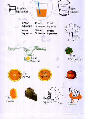
I have taken on everything that Lee has said over the last few weeks and developed a logo that is appropriate to what he asked for. My final design has changed quite abit according to what he wanted. The logo is new and fresh, coinsidently the name of the logo is Fresh. The logo is a picture of a self drawn cup with some orange juice, making the logo relate to the image with thinking about freshly squeezed orange juice. There is a straw that tilts into the juice and the name Fresh is tilted to be parallel with the straw, all the letters of the name link and join together in a abstract kind of way. Now that it has come down to the final idea we will be having a last meeting with Lee for him to pick the idea that he likes best for his record label.
Thursday, 17 February 2011
Feedback from Lee
Firstly I told Lee what he had asked me to do, then I explained how i had developed my ideas. I printed off a whole sheet of A4 that I had created designs on. He had a look at them and agreed that I had followed his advise. I had created a number of different logo ideas, but he said that his favourite was the coloured in cup in the top middle, he said the the colours that I had chosen worked really well together. the logo he said would work well with or without the name 'Fresh Squeeze'. he said that I had to look at fonts that would work really well with the style of the logo. He said that the name 'Fresh Squeeze' works but try just 'Fresh' maybe. The logo was simple but recognisable. He said that my logo did have an Indie feel and look to it, which was what he was looking for.
so now i have to go away, focus on just that logo, look at the name, change the fonts. We now have to complete this by the Wednesday after half term.
so now i have to go away, focus on just that logo, look at the name, change the fonts. We now have to complete this by the Wednesday after half term.

Wednesday, 16 February 2011
Creating ideas for Lee
Over the last couple of weeks I have been developing my logo ideas for Lee. I have changed the name to 'Fresh Squeeze' as Lee said would sound better, more enticing. So I developed my ideas using this name, I created a better feel to the logo, and chose to stick with the idea of keeping the logo to do with the name. So for 'Fresh Squeeze' I grabbed a picture of a hand squeezing an orange from the internet, and I then traced it on Adobe Illustrator. I also tried drawing my own, didn't turn out as well as I would have liked. I now have a full sheet of ideas that will go with the name of the logo. We have had feedback recently for this and Lee has decided he liked my first initial idea of the coloured cup and straw so I now have to develop this and think about fonts now for it. I have re-drawn the logo and made it a slightly different shape, but I have kept the colours because Lee said that they looked really good and worked well together. I am now choosing fonts for the name and experimenting with the position of the font. Lee also said that perhap just the word 'fresh' would work, so I have also tried the logo and just the word 'fresh' without the word 'squeeze'. Lee also said that the logo was good enough to work well without the name. So I have been thinking about that aspect as well. But for my final design I think I will keep the name there.
Thursday, 10 February 2011
Planning for Commissions ideas
After we have pitched to Martin Tucker we are now planning our commisson ideas.
We need to plan the webisodes but we need the rest of the group to do this. And we also need to plan our postcards.
I have been designing our postcards on Adobe Illustrator and planning what we should put on the postcards and the way we should write it. We have adapted our postcards so that we can fit more information on them, instead of just having the two sides, we have taken on board a fold out postcard that is still pocket size but has 8 sides. This way we have more space to fit some students comments on, that Martin said is very important. We are beginning to start storyboarding our webisodes and the way everything will be layed out. Baring in mind we only have 45seonds for each subject and building.
We have also concentrated on our budget Camcorders we will be hiring our £40.00 for 3 days, tapes are £1.50. This will hopefully cover us on the webisodes.
For the postcards paper will cost £5.99 for 500 sheets and card will cost £8.99 for 100 sheets.
Feedback for our proposals from Martin Tucker.
Martin asked us for three different promotional ideas.
1. The webisodes we were planning on doing as a whole group, he agreed that these were a good idea and that we should keep these on board and develop them. So we will be carrying on with this idea as a group. We will still be working in our separate groups inside the whole group. In the threes or pairs we have divided the departments and the buildings between us. We all have three subjects and two buildings.
2. Postcards, he liked this idea and said that they have been known to work as they have done these before, but he is hoping that we can create them for the new generation coming. While we our creating the webisodes we will be creating the postcards for each subject as well.
We have already started to develop our ideas by think about the designs and the information that will go on the postcards.
3. Posters, he said not to bother too much with the posters but would like it if we could keep in mind that the postcards could be developed into posters. The posters we are keeping in mind that the postcards may be developed into posters so the design has to look good on a poster as well.
So we have been asked to develop the postcards and make them alot better and add pictures and student comments. And we should also stick with the rest of the group on the webisodes idea and have our input with them.
Tuesday, 8 February 2011
Target audience.
This has been our main focus of this project, the target audience is key to having successful ideas. We have been asked who our target audiences are, and how our ideas will appeal to them.
We have been looking closely at mark band three of brief two that talks about the target audience.
Target audience is: Specific group that the marketing message is aimed at. The target audience can be people of a certain age group, gender etc. Target Audiences are set to focus on different groups, this is essential to become familiar with your target market.
We have also been asked to define the audience demographic. This is to define who exactly is our target audience. We have placed the age range from 14-28. We have done this so we cover those that are in there last year and secondary school and those that are coming back to college or are starting college at an older age, these students will study access courses or degrees.
Demographic audience: Advertisers often define their target market in terms of demographics; demographics are a very important aspect of media planning in matching the media with the market. Each demographic category is broken down (by the various research companies) according to its characteristics. There are probably certain groups of people, or market segments, that are more likely than others to want your product. It's important to identify such segments.
Consumer demographics:
- Age-Sex-Ethnic backgrounds - These are the important thing to take into consideration when defining your target audience. Although ethnic background may not seem to matter but we have to remember that colours and terminology differ from country to country, this is important to know so that the designer do not insult anyone, also stops from evoking the wrong set of emotions. Our products are made for different ages but are defined for those ages, the webisodes will appeal to the younger audience such as the 'Youtube/ Ipod generation' this means that the younger audiences today are controlled by the way they watch programmes now. There is no rush to watch your programme if you miss it you can record it, watch it on websites like: 4od and iplayer. People that listen to music tend to put there favourite songs on there Ipod/mp3 rather then the whole of the album. They shuffle songs so they have a wide range of there favourite tunes.
- Economic situations - In the case of something that can become very expensive you have to take into account the average wage for persons that this may be targeted at these people. Often you need to look at who the product is targeted at and change the price of thing to aim at the right target audience.
- Geographic locations - This isn't always important it just where the user lives and where they do there work. Knowing where the users live can allow everyone in the time frame to use again, usability and appealing to the audience on the basis of convenience.
- Interests and hobbies - The interests of the users can matter to the convenience of the product. And the hobbies of the users. The product has to be convenient to where the user might need to use it.
- Affluence - This will depend on how vulnerable your marketing audience is, in this case the youngest of the target audience will be at most vulnerable to the impact the that video will hopefully make on them, they are meant to be less boring and more interesting to watch.
Friday, 4 February 2011
Proposal - Martin Tucker
Proposal
We have been asked to create some promotional materials for the college, to advertise the new buildings and the courses that are on offer here, to the secondary schools and those who want to come to college to do the access course and the degree course. So our material has to appeal to a wide range of ages.
We had to come up with new ideas that would appeal to the wide range audience that we have. They have to be informative and more creative for the younger viewers. So as a whole group we have come up with the idea of creating webisodes, these are short films that run for a short time but give the detailed information needed, we started off by writing down all the main areas that needed covering, which are: Hair and beauty, health and social, art, drama and dance, sport, motor vehicle, media and photography, catering, science/forensics, music. We focused are ideas on the diploma courses. As we are part of the diploma, we thought that we could relate well towards it.
We then split into smaller groups and divided the departments between us, this way we can work as a team and get things done to a good standard. We also wrote down all the buildings and divided them between us, the buildings are: Zennor, Porthcurno, Penberth, Nanjizal, The Manor, Gwenvor, Sennen and Lamorna. The new builds are important to show, as it shows how the college is developing and expanding and the new opportunities that are on offer.
We have also thought about filming the area around college, to show that the campus is quiet and is a nice space to study in. Once the construction work is complete the campus will be a better place to study in. We have had a look at the 3D map of the college, it shows what it should look like when its complete. It was really nice to see the college complete, and showed lots of spaces to sit outside and the chill out in. This makes the college seem less of a force to be here, and gives the students areas to relax and do some work in. We are filming the different elements of the buildings filming along the corridors, such as the different departments that are featured along the corridors in each building. This will act as a map to show the individual departments, so when looking for the video you want to look at for the course you want, you will know where you’ll be based and what entertainment is around you, such as the refectories, and library uses.
We have also thought about filming the area around college, to show that the campus is quiet and is a nice space to study in. Once the construction work is complete the campus will be a better place to study in. We have had a look at the 3D map of the college, it shows what it should look like when its complete. It was really nice to see the college complete, and showed lots of spaces to sit outside and the chill out in. This makes the college seem less of a force to be here, and gives the students areas to relax and do some work in. We are filming the different elements of the buildings filming along the corridors, such as the different departments that are featured along the corridors in each building. This will act as a map to show the individual departments, so when looking for the video you want to look at for the course you want, you will know where you’ll be based and what entertainment is around you, such as the refectories, and library uses.
We have also had to come up with two other ideas per group, as we had one idea already we had two more to think of. So in are small groups we came up with two more promotional material ideas. I paired up with Gemma and we decided to create promotional materials that we could display around the college and give out. So are second idea was to create business cards for each department and write a bit about them, this way it was a necessity to pick up a huge perspective if you already knew which department you wanted to study in, also we would expand the cards so that there are more sides for more information, plus this means we can put past and present students comments on it. This would show how the college has changed and why the change was needed.
The first idea, the one we came up with as a group, is new and different. By creating individual films (webisodes) we can appeal to a wide range of ages and it will also be a fun new way to promote the college. The videos can be placed on Youtube; by doing this we are appealing to the young Youtube generation. Also by doing this the video viewers will be able to send the links to friends on social networking sites.
Our second idea was to create posters that gave out the same effect as the postcards, but in a similar way they could hold more information and be places around the college campus and secondary schools to advertise to the students, also we could place some in shop windows to advertise the older audience. This would also be advertised by the individual department about the particular course you wanted to study.
Our ideas may not be completely different and new but the way we have adapted them and the styles we uses will hopefully be original and good enough to convince people that Penwith college is the place to go. They will see just how much the college has achieved in a short time and how much it’s expanding to create the best campus for the students that use it. Target Audience
Secondary schools through out Penwith and older students for access courses and degree courses. These groups are our main focused target audience. What we want is for more people to consider Penwith college as a place of education, and one of the best places to have the education needed. We want to create promotional materials to bring more people to the college and to show them that the college is expanding and can give people the best opportunities to do what they want to do. By showing them the campus the can see that it’s new and there is lots of space to feel less manic and cramped. We give out course for those that want to come back to college or for those that never had the chance and want it. These are access and degree courses.
The budget for our postcards and webisodes.
WHSmith 100 Sheets Premium A4 Card | 1 | £7.99 |
Hire the Sony HVR Z1 for 3 days | 1 | £60.00 |
Hire iMac for 3 days | 1 | £80.00 |
EPSON Stylus SX425W Wireless Multifunction Inkjet Printer | 1 | £59.99 |
EPSON T1282 Colour and Black Ink Cartridge Multipack | 1 | £32.99 |
Total Cost | £240.97 | |
Tuesday, 1 February 2011
Ideas for Martin Tucker.
As a whole group we have got into threes or twos to work individually or are ideas for new promotional material for the college. Martin Tucker the director of Penwith college has assigned us this project we have decided upon three different ideas. One idea was that we would all work as a group and create 'webisodes' for each course. We put all the courses up on the board, and then divided them among us. Gemma and I chose to do Art, health and social, Drama and Dance. And we also have to film Zennor and Porthcurno. For these will film the groups while working, and create webisodes from them. We then came up with two ideas for our individual group, so Gemma and I came up with the idea of creating business cards that advertise each department. Then we thought about a poster that would also advertise each department.
At the moment we are planning and writing up the proposal, so that we can pitch to Martin our ideas. We're hoping that as a group we will work really well together, and will combine some really good ideas to make this project. We are now thinking about how we will film our webisodes. As we are doing the media and photography together, Armando has said that we can use it as our practice one, we will do it as a group so when we do our own we know what we should be doing.
At the moment we are planning and writing up the proposal, so that we can pitch to Martin our ideas. We're hoping that as a group we will work really well together, and will combine some really good ideas to make this project. We are now thinking about how we will film our webisodes. As we are doing the media and photography together, Armando has said that we can use it as our practice one, we will do it as a group so when we do our own we know what we should be doing.
Monday, 31 January 2011
Questions to ask access students and degree students.
What attracted you to this college?
What made you think about coming back to college?
What they would like to change/ develop whilst studying here?
What do you want to have acheived when finished your year at college?
Do you think that coming back to college will help with finding future jobs?
Why didn't you finish or start college?
What do you think about the college?
What do you like about the campus?
What course are you studying?
What do you like about the course?
Firstly we spoke to a access student, who is studying the access 2 health and social care.
She said that the course is really intensive, hard work but can be fun. She said that its hard because you cover lots of subjects in one, biology, maths, physcology, english, sociology. This is useful beacuse it can prepare you for a number of jobs and will also prepare you for a degree. Also they develop skills.
she chose to study here beacuse of the price of the access course. better price compared to other courses. And offers a lot.
Found the course attracted to those that want to nurse - biology.
Access course offers university degrees.
Wants to go on to teach, so the maths that is studied can offer this.
The college is alot better now from when she first came to study as a 16 year old. Buildings have improved, resources.
Secondly we spoke to a foundation degree student who was doing a 2 year course in community and youth work.
She chose this college on the basis it was local and close to home. Easier to access. New builds that offer alot more.
Penwith seems a really positive place, has had a great time, local community.
Great course, staff are supportive, resources, places to go.
She is a single mum, decided to wait to begin this course until her children were in secondary school, wants to also set a good example for her children.
Course- community work, working with young people, volenteer work, work placements, working with those that have mental health - said that she enjoys this part the most, feels that she is helping others.
Didn't think that she would enjoy going back to college as much as she has done. She now only has 8 weeks left of the course and is hoping to go on to do teaching.
Meeting with Martin Tucker.
Martin doesn't want our promotional material to just attract 16 year olds, he wants those that want to come back to college, or to study.
He wants us to promote the new buildings and show the public how much Penwith college has developed over the last few years.
We thought about getting some of the student opinions of the school, past students, and students that are studing here today.
We also want the lecturers opinions of the new builds and how the college has developed.
We want to promote to as many secondary schools as possible. Also to promote the courses that are on offer here, the new campus, activities outside of college, new friends, new experiences.
Martin wants us to create 3 initial ideas that we will show to him and he will give us feedback. We have to tell him how we will sell our ideas and he will give us a budget that we will work around.
Thursday, 27 January 2011
Ideas
This is the first draft for my name and logo design. The name I have chosen is outranked, I have chosen this name because it is ironic to what I hope the record company can achieve. Hopefully the record company won't be out ranked and will do well and produce some good bands, and be popular. I have drawn three designs for this name, but I have stuck closely to a theme. The theme is Rank meaning when you get ranked (position) in the army. In the forces you ranked according to your importance. So my logo designs are based upon this. The first design is besed on the second world war Nazi patch, using the wings from the eagle I have created a proud looking logo.The second I have used the patch for the navy that uese the three gold arrows that point down and created a retro feel to the design. The third and final design is a simplistic its simply a record and hes a label coming of the side with the name on it.
I have now thought about the other two that I will be presenting to Lee.
I have now thought about the other two that I will be presenting to Lee.
Presentation Feedback.
Yesterday we presented our ideas to Lee and he gave us feedback on each of them, then told us to develop one. I will scan the originals in at some point so that I can show the changes that will be made by the end of this section of the unit.
Out-Ranked logo.
For my first idea he said that it perhaps had too much association with the forces, and also that my first design would look better on something like on an album cover.
Progress logo.
For my second idea he said that he liked the simplicity of the design, but reminded him of a 'working progress' which he didn't really want.
Freshly Squeezed logo.
For my third idea he said that he preferred this one over all. He said the design even looked 'fresh' he said perhaps shorten the name 'fresh squeeze'? And said the font may look good in the 'factory records' font.
So he said that developing my third idea would be best.
So we now have a week to do this. To develop our idea more and then we will pitch our final idea.
What I now have to do.
I am now taking on board what Lee has asked for my final design.
I have thought about changing the name from 'Freshly Squeezed' to 'Fresh Squeeze' and I have re- designed the logos. The logo that Lee liked the most was the last one, so I have tried to develop this one more. I have added a picture I took from the Internet as a draft, this picture is of a hand squeezing an orange. I have also made a copy of the originals and: coloured them, changed the position of the text. I have created the copies so that I can use them as templates so that I can re-create the same image differently.
I am now in the middle of playing around with different colours and fonts that would suit the logo best, and I am trying to find one that looks or resembles the factory records font that Lee suggested would work.
I am still trying to think of words that re-create the word 'fresh' that i could take on, but i think fresh sums up the design very well. I think the use of the orange tells the audience just how fresh it is. When I think of oranges I think of a hot summers day and drinking fresh chilled orange juice. Its re-freshing and tastes good.
I think having the orange being squeezed and having the droplets of orange juice coming off, it really makes the mouth water. And appeals more.


These are just some of the ideas I showed to Lee at the pitch, he preferred the first of my freshly squeezed logos.
I have been developing my ideas over the last week, I have only developed the one that Lee liked the most which was the freshly squeezed logo. I have changed the name to Fresh squeeze, and I have created some new designs. I have advanced the first ideas and created some totally new ones. This way I have given my client what he has asked for and I have also given him a choice of designs that I'm hoping he will like.
Wednesday, 19 January 2011
Questionnaire
What brand logos appeal to you?
What does this logo make you think of?


What does this logo make you think of?

What does this logo make you think of?

What does this logo make you think of?
What do you look for in a logo?
Colour?
Bright colours?
Bold colours?
Primary colours?
Design?
Stands out?
Simple?
Bold?
Relative to the product?
Has the products name in the title?
Has a picture of the product?
Or has a logo that isn't relative at all?
Font style?
Bold?
Readable?
Clear?
Has relevance to the style of the company?
Or the product?
Text size?
Big?
Small?
Bold?
Pictures?
The logos that make you think of something?
The logos that make you think of the product?
What makes the logo successful?
Results from the questionnaire.
What brand logos appeal to you?
Disney, McDonalds, Zara, Oasis, Roxy, Superdry, New look, Blackberry, Redecko, Nike.
A couple of people didn't seem to understand this question, either they left it blank or they put things describing a logo such as bold.
What makes you like the brands logo, the aspects of the logo?
Bold, eye catching, interesting, names, quality, colour, font, contrast, simple, memorable, looks good, different, logo.
A lot of people thought that the logo had to stand out and appeal to interests.
What does this logo make you think of? (Subpop)
Train line symbol, TV programme, Music chart, Poster title, Subway, a drink, pop with an edge, sub-genre of music.
Most of the people understood the meaning, and were able to dictate what it meant to them, some people thought I wanted them to describe the logo to me.
What does this logo make you think of? (Island)
a travel agency, holidays, desert island, tropical island, paradise.
lots of people thought about holidays when they think of this logo, and described that the holiday was time to get away. Again they were able to dictate their own interpretation of the logo.
What does this logo make you think of? (Factory)
industrial, factory line, work, old factory, pollution, railway poster, labour, Victorian, urban/street music, global warming.
Lots of people thought about work when they saw this logo, some people thought further on into this and thought about Victorian times of labour.
What does this logo make you think of? (Trash aesthetics)
Bins, bands, punk, clothes, gas station, car logo, sports teams, route 66 sign.
A lot of people were more attracted to this logo. They had more of an understanding about the logo. And were more enthusiastic about there thoughts.
What do you look for in a logo?
Colour?
Bright colours? Most people thought that bright colours would help the logo sell.
Bold colours? Some people thought that bold colours would help the logo sell.
Primary colours? Know one thought that I should stick to the primary colours.
Design?
Stands out? Some people thought that the logo should stand out.
Simple? Most people thought that the logo should be simple.
Bold? Only a couple of people thought the logo should be bold.
Relative to the product?
Has the product name in the title? Some people said that the products name should be the title.
Has a picture of the product? Most people said that the logo should include a picture of the product.
or a logo that isn't relative at all? A couple of people said that the logo shouldn't be relative at all.
Font style?
Bold? Some people said that the font should be bold?
Readable? Most people said that the font should be readable.
Clear? A few people said that the font should be clear.
Has relevance to the style of the company? Know one thought that this should matter.
Or the product? One person said that the font should be in the style of the product.
Text size?
Big? An equal amount of people said that big should be a good text size.
Small? Some people said that small would be a good size text.
Bold? An equal amount of people said that bold should be a good text size.
Two people added that perhaps a medium text would be appropriate.
Pictures?
The logo that makes you think of something? Some people said that the the logo should remind you of something.
the logo that makes you think of the product? Most people said that the product is more important.
What makes the logo successful?
Simple and relates to the product. Eye catching using elements from above.
The concept of it.
Something that people will remember, simple and eye catching.
A logo which works well with the product and one that people can understand.
Memorable.
Boldness, appeal, attracts the eye.
The colour.
Being recognisable and memorable.
What does this logo make you think of?
What does this logo make you think of?

What does this logo make you think of?

What does this logo make you think of?
What do you look for in a logo?
Bright colours?
Bold colours?
Primary colours?
Design?
Stands out?
Simple?
Bold?
Relative to the product?
Has the products name in the title?
Has a picture of the product?
Or has a logo that isn't relative at all?
Font style?
Bold?
Readable?
Clear?
Has relevance to the style of the company?
Or the product?
Text size?
Big?
Small?
Bold?
Pictures?
The logos that make you think of something?
The logos that make you think of the product?
What makes the logo successful?
Results from the questionnaire.
What brand logos appeal to you?
Disney, McDonalds, Zara, Oasis, Roxy, Superdry, New look, Blackberry, Redecko, Nike.
A couple of people didn't seem to understand this question, either they left it blank or they put things describing a logo such as bold.
What makes you like the brands logo, the aspects of the logo?
Bold, eye catching, interesting, names, quality, colour, font, contrast, simple, memorable, looks good, different, logo.
A lot of people thought that the logo had to stand out and appeal to interests.
What does this logo make you think of? (Subpop)
Train line symbol, TV programme, Music chart, Poster title, Subway, a drink, pop with an edge, sub-genre of music.
Most of the people understood the meaning, and were able to dictate what it meant to them, some people thought I wanted them to describe the logo to me.
What does this logo make you think of? (Island)
a travel agency, holidays, desert island, tropical island, paradise.
lots of people thought about holidays when they think of this logo, and described that the holiday was time to get away. Again they were able to dictate their own interpretation of the logo.
What does this logo make you think of? (Factory)
industrial, factory line, work, old factory, pollution, railway poster, labour, Victorian, urban/street music, global warming.
Lots of people thought about work when they saw this logo, some people thought further on into this and thought about Victorian times of labour.
What does this logo make you think of? (Trash aesthetics)
Bins, bands, punk, clothes, gas station, car logo, sports teams, route 66 sign.
A lot of people were more attracted to this logo. They had more of an understanding about the logo. And were more enthusiastic about there thoughts.
What do you look for in a logo?
Colour?
Bright colours? Most people thought that bright colours would help the logo sell.
Bold colours? Some people thought that bold colours would help the logo sell.
Primary colours? Know one thought that I should stick to the primary colours.
Design?
Stands out? Some people thought that the logo should stand out.
Simple? Most people thought that the logo should be simple.
Bold? Only a couple of people thought the logo should be bold.
Relative to the product?
Has the product name in the title? Some people said that the products name should be the title.
Has a picture of the product? Most people said that the logo should include a picture of the product.
or a logo that isn't relative at all? A couple of people said that the logo shouldn't be relative at all.
Font style?
Bold? Some people said that the font should be bold?
Readable? Most people said that the font should be readable.
Clear? A few people said that the font should be clear.
Has relevance to the style of the company? Know one thought that this should matter.
Or the product? One person said that the font should be in the style of the product.
Text size?
Big? An equal amount of people said that big should be a good text size.
Small? Some people said that small would be a good size text.
Bold? An equal amount of people said that bold should be a good text size.
Two people added that perhaps a medium text would be appropriate.
Pictures?
The logo that makes you think of something? Some people said that the the logo should remind you of something.
the logo that makes you think of the product? Most people said that the product is more important.
What makes the logo successful?
Simple and relates to the product. Eye catching using elements from above.
The concept of it.
Something that people will remember, simple and eye catching.
A logo which works well with the product and one that people can understand.
Memorable.
Boldness, appeal, attracts the eye.
The colour.
Being recognisable and memorable.
Saturday, 15 January 2011
Primary Research.
We had a meeting with Lee on Wednesday 12th January, and he explained what he wanted, so that we could help create it for Unit 2- Commission. What he wanted was an online record company, that would have an open genre. He asked us if we would create a name and a logo for the record company, he said that bands formed in college will be welcome to sign but must get passed a panel of judges just like others would need to do. He asked us to create a name that was original and that didn't have anything to do with the college, a logo also. He wants the name and logo to be clear and recognizable and wants it to attract a specific target audience of the ages 18-28. He wants the name and logo to look good on merchandise and at gigs.
We have two weeks to think of three names and three logos for each of those names, then we have to pitch our ideas to Lee, and let him decide.
I have created a mind map on Mindmeister to show how I went about finding names for the record label, I have come up with a few but only a couple that I like, and ones that I can create logos for. I have thought of one that I am comfortable with and ones that I didn't have a lot of trouble creating logos for. I am thinking about the other two that I can create. My mindmap consists of words that the meaning are relevant to a record company, such as words like Octave, Sound, Obsession etc. We will have to stick to what our client has specifically asked for, so that we ensure our client will receive what they have asked for. We have been told that we should all pitch three different ideas and that Lee will ask us to develop one of our ideas with more descriptions and detail. Then we will pitch our final idea and Lee will pick only one of ours for the name and logo for the record company. I have been developing a good understanding of what Lee wants for the logo. I have been taking on board the things that he has specifically asked for such as having the record company as an indie style, independent and new. He wants the record company to be new and attractive to all sorts of music genres to advertise to everyone. So the name has to be fresh and adventurous. So my first initial ideas were based along the lines of the words new and fresh. By doing this I have stayed clear of let the logo have anything to do with the college itself, which is something that Lee wanted. I have be doodling some simple designs down that would look good on merchandise such as t-shirts, lighters, hats etc. Also something that will look good on posters.
Secondary Research
Sub Pop is a record label that was created by Bruce Pavitt and Jonathan Poneman in Seattle, Washington in 1986.
Sub Pop records achieved fame in the late 1980s by first signing Nirvana, Soundgarden, Mudhoney and many other bands from the Seattle music scene. They are often credited for popularsising grunge music.
This makes me think of a road sign, or a bands logo. The black and white have been used really well to contrast next to each other. It gives of a certain power to the logo.
This makes me think of a road sign, or a bands logo. The black and white have been used really well to contrast next to each other. It gives of a certain power to the logo.
Island Records is a record label that was craeted by Chris Blackwell in Jamaica. It was based in the United Kingdom for many years and is now owned by Universal Music Group. The label now operates as a division of The Island Def Jam Music Group in the United States.
This logo is simple but can mean deep meaningful things like wanting to escape with (the sound of music), wanting a sense of freedom(when listening to music), makes me think of a hot relaxing place where listening to music would be easy to do. The logo is strong as is recognisable.

Factory records may seem simple and a bit plain but I think that it says that the produced music is created here, its like a story that tells us the beginning of the story. The colours are bland but the red works really well with making the logo stronger and much more effective.

Trash Aesthetics is an independent record label founded in 2004 by Rob Fawkes and Claire Hewitson. Based in South London, it specialises in releasing limited-edition runs of singles by both local bands and international acts whose work is difficult to come by in the UK.
The label's first release was a 7" clear-vinyl pressing by Bloc Party called She's Hearing Voices.
This logo reminds me of a clothes range, a successful clothes range like superdry. The blue and red are both domenent colours so level each other out to create a good contrast.
Subscribe to:
Comments (Atom)